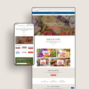
Elise Design Company is a Charlotte-based shop owned by Christa Bergstresser offering minimal, thoughtfully made jewelry and home goods. Her product specialties include laser-engraved wood and acrylic pieces that boast a modern aesthetic and are blended with natural elements for effortless wearability.
Christa is one of the kindest people we have ever met and had the privilege of working with. “Designed with intention / Crafted with passion” is not only an accurate representation of the products Christa creates, but also in the words and actions she chooses to share with others. She is a ray of positivity and will cheer you on in every season!
On Earth Day 2021, Elise Design Company started planting trees with every single customer purchase to give back to our lovely little (big) planet.
Keep reading for a look into the new logo design we created for Elise Design Company earlier this year.
MOODBOARD
Word lists are one of our favorite ways to get creative juices flowing. I learned about this helpful little exercise in my first semester of design school, and I guess it just stuck. Some of the words written down for Elise Design Company were:
- intentional
- genuine
- geometric
- versatile
- modern
- urban
- timeless designs / not trendy
- neutrals
- mixed media
- wood burnt edges
- duotone
- light refraction
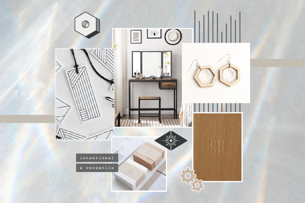
A little snippet of feedback from the client we got on this moodboard was this:
I enjoyed soaking in every collective aesthetic and individual element of this board and I’m going to let you run with this — know you have a huge thumbs up for all of it!
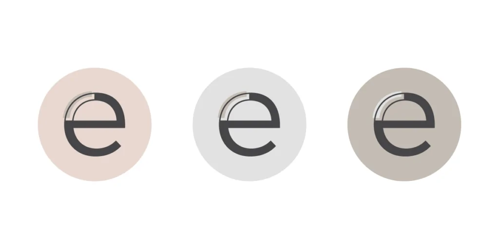
COLOR PALETTE & TYPEFACES
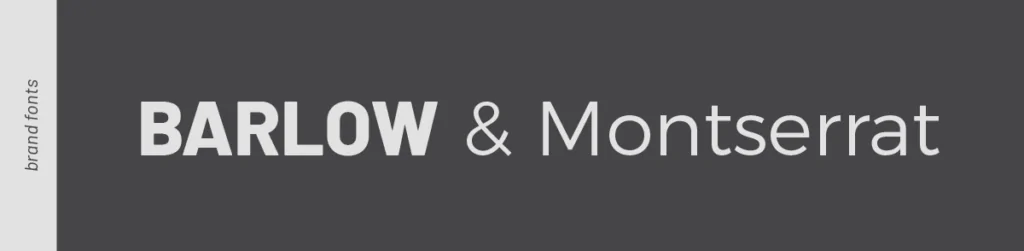
Elise Design Company’s existing brand font was Montserrat, so we didn’t want to shy too far from that. We kept the same overall vibe and added in a font called Barlow for added visual hierarchy. This guy is a bit more tall, dark and handsome and fits well into main headlines and smaller captions.
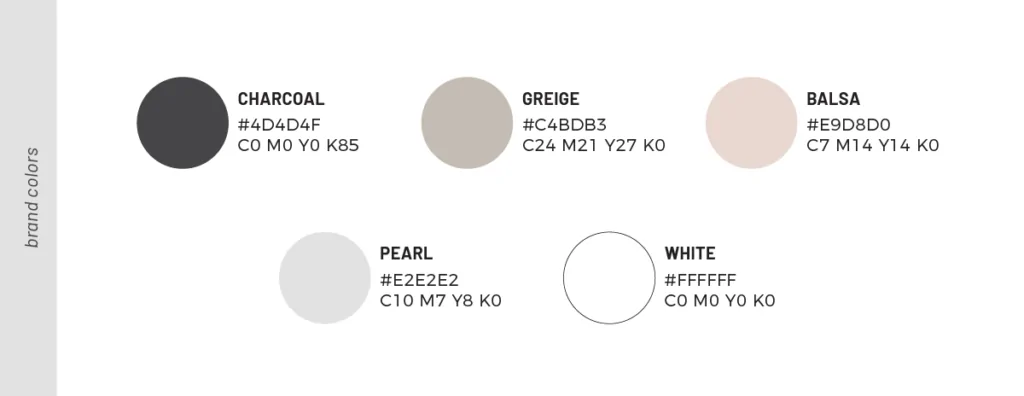
Because Christa works so often with lighter wood tones and other natural materials, we decided to go completely neutral on the color palette. This will allow the products to mesh well with the overall visual brand, but also stand on their own for “special edition” collections (like these cutie pastel bobbles) that might happen to include more color and pattern play.
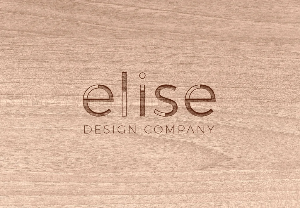
FINAL LOGO & MONOGRAMS
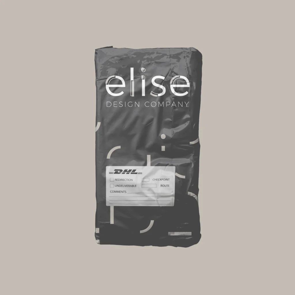
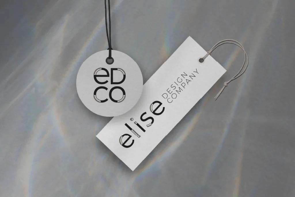
As we went through the process of creating the final logo mark and its other variations, we had a lot of fun playing around with potential patterns. Literally breaking apart the main logo left us with fragments of letters that create some interesting shapes. “Adult confetti” is the name of the game, and the mockup below shows how this pattern might be used on packaging. You can also see examples of the final monograms created for Elise Design Company.