Logo Design: Chantelle Jordan Photography

Chantelle Jordan Photography is a photographer based out of Charlotte, NC, but frequently travels to South Carolina and beyond. Chantelle offers lifestyle wedding, family, maternity, newborn, and boudoir portraits — she has you covered at every stage of life. She also offers a unique studio space decorated with bohemian interiors for her clients to utilize for their sessions.
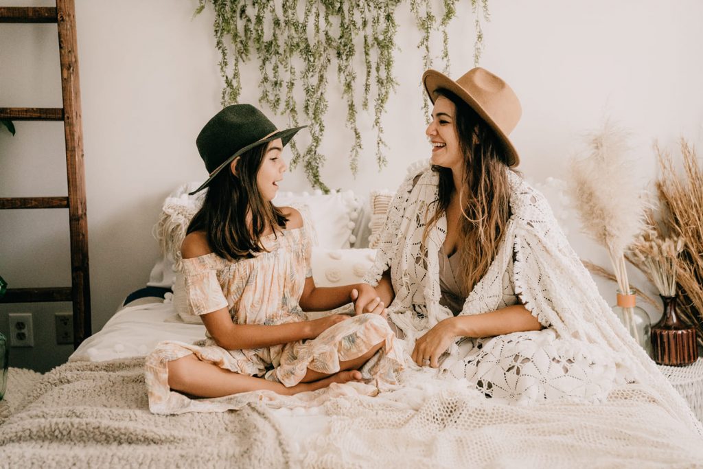
As we began the logo design process (questionnaire & moodboard), we knew we had to include some of the boho elements she loves so much and implements into her own lifestyle so well.
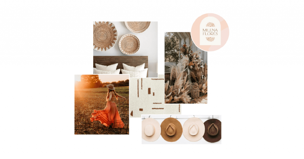
MOODBOARD
We started with a moodboard showcasing a lot of texture and earth-tone colors. Chantelle’s brand and photography style is between cool and calm and bold and bright. Naturally, that’s where we headed for her visuals.
COLOR PALETTE & TYPEFACES
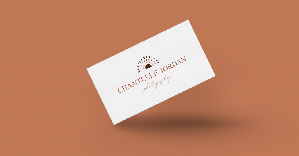
FINAL LOGO & MONOGRAMS
Colors tell a story, evoke emotions, and add that “something extra” to objects and images. But we always err on the side of “a one-color logo is a well-planned logo”. In the first round of any logo design or visual branding project, we show the client all concepts in one color — black.
Black is obviously very simple and doesn’t distract the eye when deciding whether or not the form and function of what we are presenting works for you. Once the client decides on the best concept for their brand or business, we move on to adding in color (to help tell the story, evoke emotion, etc.).
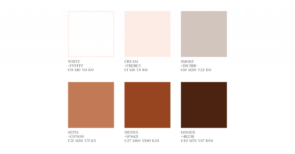
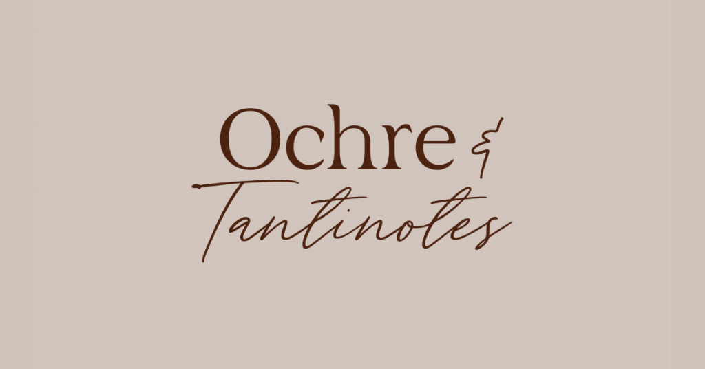
We ended up going with a monochromatic color palette with deep oranges and muted neutrals. Keep scrolling to see the final logo, along with some of the secondary marks and alternative logos.
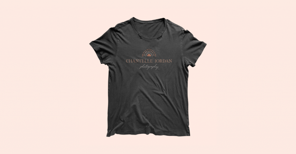
Below, you will see the black and white version, and the color version, of the main logo for Chantelle Jordan Photography.


