Branding: Cheri Parker Design
Cheri Parker Design carries unique, well-crafted bags with a bit of whimsy. The entire collection of Cheri Parker bags appeals to those who like to show off their personal style, have fun, and try something new.
When we asked Cheri how her products stood out from the rest, she mentioned her unique eye for mixing unexpected prints and patterns with simple design. In her own words, “It’s not about fashion — it’s about being grateful for who you are and sharing that with the world.”
We wanted to use that sense of bold pattern making and design in the final visual brand identity. Keep scrolling to see how that played out in her logo marks and other brand elements.
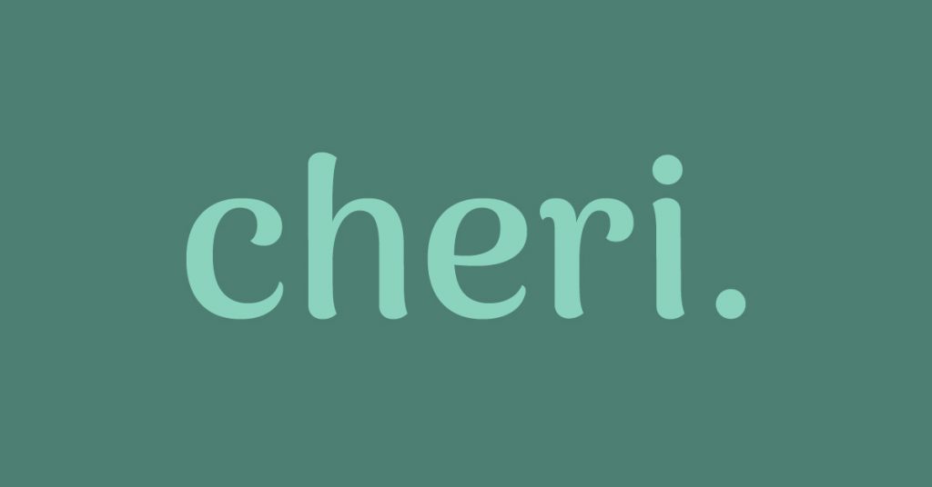
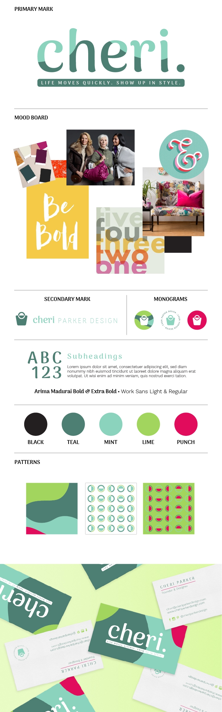
FINAL LOGO & MONOGRAMS
After reading Cheri‘s completed brand questionnaire, we knew we had to go full force into the bold, whimsical, and feminine nature of her products and name.
The target audience for this brand is women ages 30-65 and they love: shopping small, feminine environments (like boutiques and cafes), keeping up with trends, and sharing and learning about lifestyle tips. We presented a simple scenario to Cheri in which two women are conversing:
Woman 1: Oh, I am in love with that bag! Where did you get it?
Woman 2: Thank you, love. It’s a Cheri bag!
With this concept, we proposed the idea of using the name ‘Cheri’ as the identifying element of the brand. It’s cute, short, and overall an easy visual cue for customers to remember.
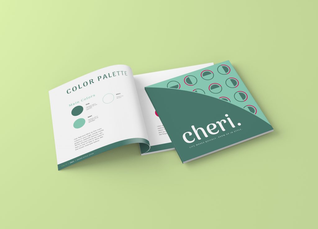
COLORS, PATTERNS & OTHER BRAND ELEMENTS
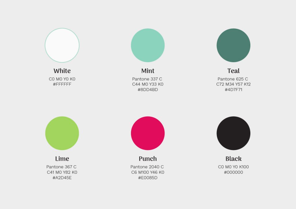
The color palette is a good balance of calm and steady plus a little bit of spunk. The greens and blues are the anchor for the vibrant “punch” / hot pink so it doesn’t completely run the show. Abstract color blocking with these brand colors is a nod to Cheri’s signature bold pattern making and mixing.


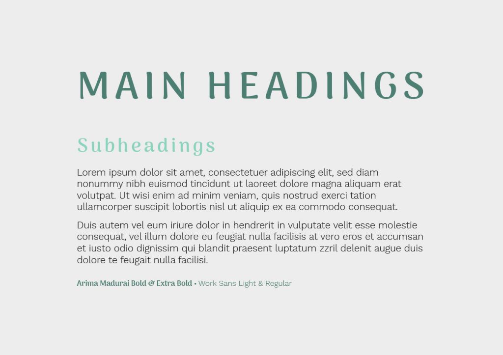
FONT PAIRING
TAG LINE & MISSION STATEMENT
We brought on a copywriter to help develop a tag line and mission statement for Cheri Parker Design.
Justine Wiggins is a woman of many talents. She is owner of jewelry brand Worthy + Badass, a professional organizer with Step by Steppe Solutions, and a wonderful wordsmith that helps small businesses navigate their brand voice and positioning with words. You will likely see more collaborations with Justine in the future!
Cheri loved many of the options we presented, but ultimately chose the below statements to represent her brand:
Tag Line:
Life moves quickly. Show up in style.Mission Statement:
cheriparkerdesign.com
With a simple goal in mind, it is our mission to create bags that don’t just stand out — they complement and elevate your personal style. We measure success by the lasting relationships we build with our clientele and our continued support of Companions for Heroes.
10% of each purchase from Cheri Parker Design is donated to companionsforheros.org. They match dogs that would be euthanized, free of charge to active duty military personnel, military veterans, first responders, military spouses and children and Gold Star Families recovering from the psychological challenges they suffered during service to our country.
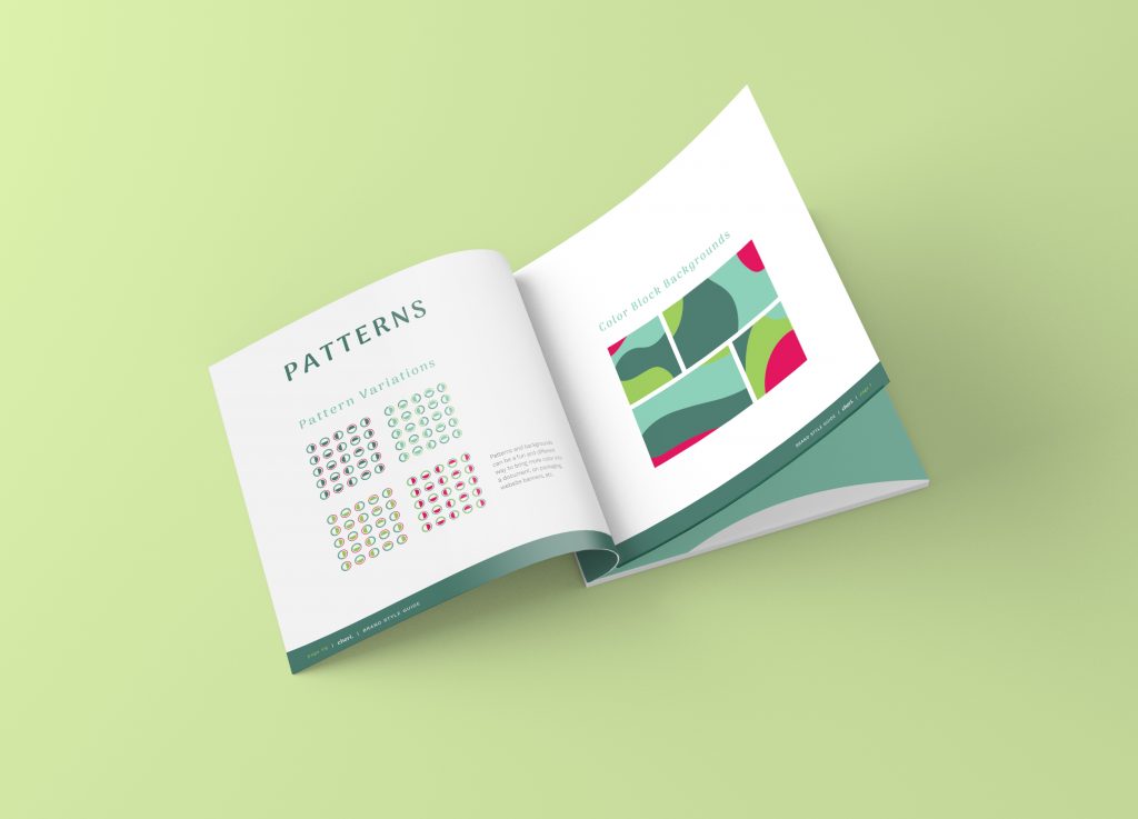
BRAND STYLE GUIDE
With all of our full branding packages, we provide a Brand Style Guide that includes relevant information on how to use your new brand elements to represent your visual identity in the best way:
- Color palette
- Logo versions
- Patterns
- Font styling / pairing
To view the full Brand Style Guide for Cheri Parker Design, click here.
TEAM MEMBERS
Art Director & Designer: Dana Gray
Copywriter: Justine Wiggins
PIN THIS!