
Here’s a little secret: people judge products by their colors and overall aesthetic. Even before they sniff, feel, or taste-test, the first thing someone notices is the packaging. And in the world of product design, color isn’t just a pretty accent; it’s a full-on marketing superpower. Understanding color psychology in packaging (and other graphics) can make your products irresistible — especially as we slide into all things cozy fall and festive holiday.
During my time as a graphic designer for store signage at Lowe’s, each and every major holiday had a “sub-brand” feel to it. Marketing would go through exercises to create moodboards, themes, patterns, and specific graphic elements to tie in each seasonal holiday with the main corporate branding. For example, spring had extra pops of pinks, greens, and yellows, while Christmas / holiday had accents of deep greens and burgundy, etc. All of the new sub-branded elements tied the overall product messaging together throughout in-store signage, digital ads, website ads, and also TV spots.
Even though all of the products were home improvement and decor focused, that created a great precedent for how to treat seasonal products throughout the year. I apply a lot of what I learned during that time to the clients that come to me for seasonal product packaging and promotional graphics now.
Why Color Matters (More Than You Think)
Color is the unsung hero of product design. Studies suggest that we make a snap judgment about a product in 90 seconds — and up to 90% of that judgment is based on color alone. That’s right: your packaging colors could make someone reach for your coffee blend instead of the brand across the aisle, or swipe past it entirely.
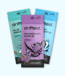
Different hues communicate different things without saying a single word:
- Red: Bold, passionate, “buy me now!” energy
- Orange: Friendly, fun, maybe even a little mischievous
- Yellow: Cheerful and optimistic — basically sunshine in a box
- Blue: Calm, trustworthy, dependable
- Green: Fresh, natural, maybe even “I care about the planet” vibes
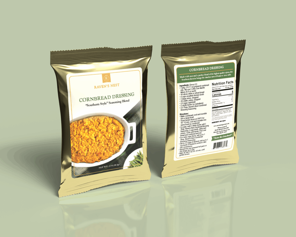
- Brown: Comforting, grounded, like grandma’s favorite sweater
And here’s where it gets seasonal: fall is basically a freebie for color psychology. Burnt oranges, deep reds, golden yellows — these shades scream cozy sweaters, pumpkin spice everything, and binge-watching Hallmark movies. Perfect for packaging that wants to feel approachable, warm, and irresistible.
Using Fall Colors Without Overhauling Everything
Updating your packaging for fall doesn’t mean tossing your brand colors out the window (please, don’t do that). You can get seasonal magic with a few clever tweaks:
- Swap accent colors to rich autumn tones
- Add subtle seasonal graphics — a leaf here, a pumpkin there, background patterns behind a callout
- Highlight seasonal flavors or scents with a color cue (yes, that pumpkin spice latte deserves the burnt orange label)
- Even a sticker or limited-run sleeve can give the impression of a seasonal refresh without triggering a full redesign panic.
Quick Tips for Fall Packaging Magic
- Accent, don’t overhaul — keep your brand recognizable
- Try seasonal labels or stickers for a playful, limited-time feel
- Test new colors with a small audience first (like your email list’s top engaged customers)
- Make sure your product still looks like “you” — just cozier
Wrapping It Up
Color is way more than decoration; it’s a secret weapon for product packaging. Using color psychology in packaging, especially with a seasonal twist, can make your products feel cozy, exciting, and totally unmissable on the shelf.
Want to make your packaging pop for the upcoming holidays? Reach out to get started!