Branding: Sweet Spot Studio
We teamed up with Jossie Lukacik with Sweet Spot Studio to do a complete brand refresh for her business.
Sweet Spot Studio opened in Fall 2018 to satisfy the cravings of curious and aspiring bakers of Charlotte and surrounding areas. [We] offer pastry and baking classes to all levels of bakers, whether you’ve never measured a cup of flour or you’ve already mastered macarons, as well as intensive workshops for industry professionals. [The] classes are fun, educational, and delicious. Perfect for a girls’ night out, date night, mother-daughter time, and anyone looking for an enlightening outing!
Sweet Spot Studio
At the beginning of every branding project, we send a questionnaire that asks all the hard questions for business owners. Who are your competitors? What makes your business unique? Who do you serve?
This brand refresh was such an exciting project for two main reasons: 1) Sweet Spot Studio knows who they are, who they serve, and they have attainable plans for expanding in the future. 2) Jossie was such fun to work with! She gave direction in what she wanted right from the start. We were able to run with the concept(s) and really have fun with creating the branding elements, patterns, etc.
The words that encompass Sweet Spot Studio are welcoming, encouraging, educational, and sweet. We felt that the visual brand identity should match that.
There are actually three different “branches” or sub brands to Sweet Spot Studio. We took a stab at creating a custom logo type that could be utilized in each of the sub brands to maintain consistency. Each sub brand has its own color scheme to be used across all branding elements, print collateral, social media, website, etc.
Sweet Spot Studio
is the spot for learning new baking and cooking skills. This sub brand uses the “Azure” color scheme.
Sweet Spot Kitchen
is the second sub brand. This is Sweet Spot’s commercial space that other bakers and pastry chefs can rent in order to run their own businesses. This sub brand uses the “Mustard” color scheme.
Sweet Spot Cookie Club
is a new concept that will be expanded on in the future. “Pink Icing” is the color scheme for this sub brand.
Additional Brand Elements
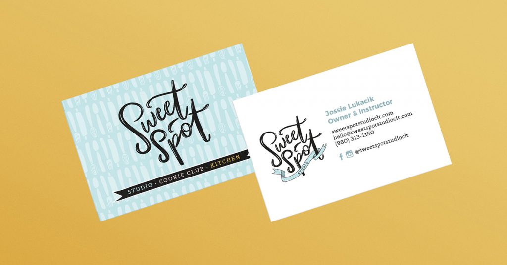
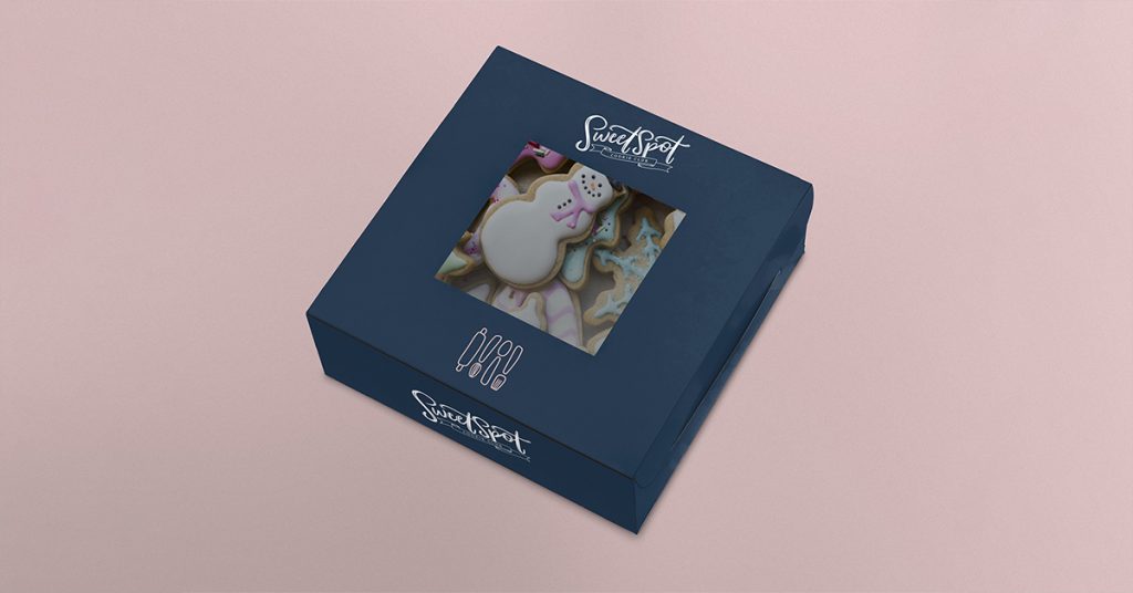
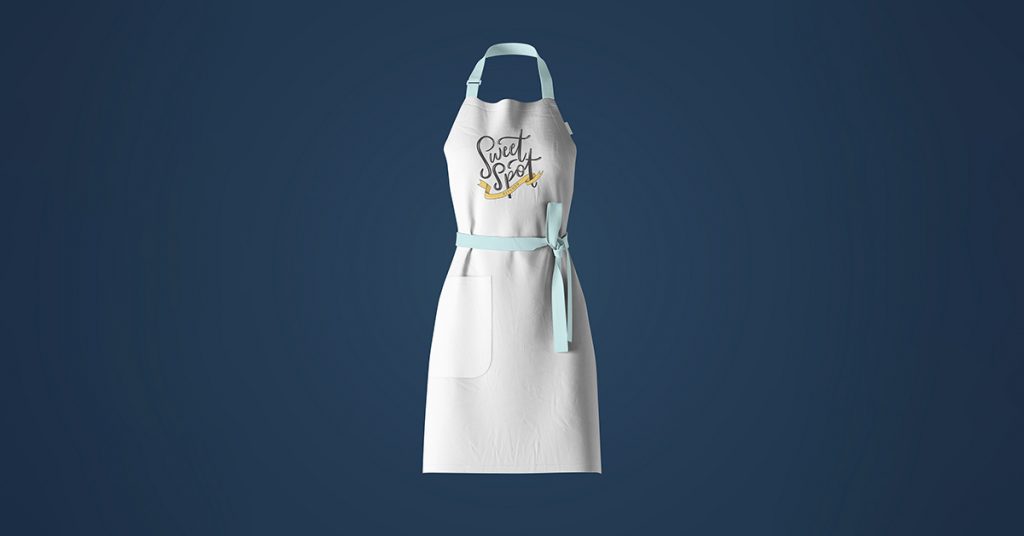
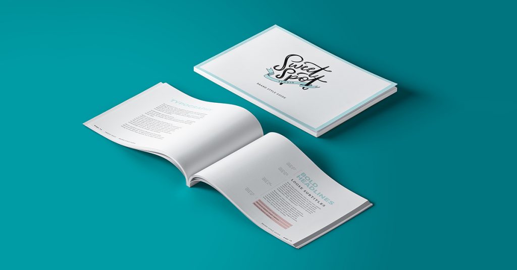
Take a look at the additional mockups below to see some of the final color palettes, patterns, and other branding elements delivered to our client.

Pingback: Website Design: Sweet Spot Studio | Dana Gray Studio